Visualizing the Human Cost of Deadly Force Policing in America

Submitted 25 April 2021 by Theresa Foster to fulfill the assessment requirements for the Data Visualization module on the MSc Data Analytics course at Oxford Brookes University
To view the final project dashboard (eshiny app) created through R, including visualizations and interactive Map, see here:
https://theresakfoster.shinyapps.io/test/
1. Data Selection and Context
1.1 Curiosity
Due to my background in the non-profit sector, I have always been interested in learning more about social justice issues with a focus on how these problems can be solved to create positive change. When considering a topic and dataset for this assignment, I wanted to reflect this interest in the subject matter. Some possible ideas included visualization of data on Refugee resettlement in the UK by city or county, or country of origin. I searched for potential datasets online and decided to investigate available data on Kaggle as there is also a ranking system for the reliability and veracity of the datasets uploaded. In searching through the Humanitarian section I found a dataset that included information on the people who had died as a result of deadly force used by the Police in the United States over a five year period. The issue of American police using deadly force, particularly disproportionately against Black and Latino men, is historically well established and sadly continues to this day in 2021. As an American from the South in particular I am very conscious of this on a political and personal level and I decided this was an important issue to highlight through this assignment.
1.2 Data Selection and Justification
The dataset from Kaggle is called U.S Police Shootings and was compiled, cleaned and uploaded by Ahsen Nazir for open source use in order to better understand the role of Racism within Police shooting deaths in the United States of America (USA) (2020). The data includes records from 02 January 2015 to 15 June 2019. The dataset is already cleaned and the values are standardized and complete, which will make the formatting process fairly simple. There are 4,895 individual cases and 15 variables including: unique case identifier, full name of the person killed, manner of death, object they were armed with (or if they were unarmed), age, gender, race, city where the incident occurred, state, whether there were signs of mental illness, the police determined threat level, whether the person was fleeing the police, if a police body camera was used or not and finally the broad category of weapon involved if any.
For the mapping data required for my visualization, I was able to find an open source csv of USA cities and their latitude and longitudes from simplemaps.com. However I have also found there may be some bespoke R packages particularly for mapping the boundaries of States and counties in the United States that could also be useful, such as urbnmapr. Additionally I have found shapefiles of states and census data that may be useful later on ArcGis Hub (2021). I was able to use these additional data sets to create a final joined dataset. I used census data to calculate the demographic proportional data of shootings by race per 100,000 people in each state and also mapped each incident to a set of map coordinates. This allowed me to create further map based visualizations and better presented the impact of the shootings by Race than the raw numbers.
2. Circumstances and Vision
2.1 Audience
As this project is initially for a module assignment, the direct audience will be the module instructor and possibly my classmates. However I do plan on adding some of my completed projects to my website to build a portfolio of skills for future employers as well. I would like the finished product to educate a global audience on the extent of fatalities as a result of policing policy in the United States and to highlight the disproportionate impact this has on people of colour and those experiencing mental health issues.
2.2 Constraints
This project is subject to the timescale of the semester and will be due for submission by 30th April 2021. Therefore it needs to be reasonably achievable within the equivalent of 4 to 7 full working days, considering my other assignment and work commitments. The coursework rules do require the chosen dataset to have at least 1,000 records with a minimum of 10 discrete and continuous variables.
2.3 Consumption
The visualization will be a one-off project developed to be viewed and interacted with based on a discrete time range dataset. However it may be possible to expand on it in the future if more recent data is made available or if I decide to expand the charts used to convey new information following additional analysis of the variables.
2.4 Vision and Deliverables
I would like to use the fill dataset as I want to create an interactive Rshiny web application that will allow the viewer to adjust for different variables in the visualization. I am planning to mirror to some extent the crime mapping exercise from our practical sessions, but instead I would like to map each recorded incident by city on an interactive map of the United States. The user will be able to click on each incident to see more information including the person’s name, age, date of death, weapon type (if any) and mental health status. The incident markers on the map will be coloured based on factors such as Race. Depending on how the process goes I would also like to do something that will show the audience some correlations, if any, within the data, particularly in regards to whether the officers involved were wearing body cameras or not.
2.5 Resources
The visualizations will be created using R Studio and the Rshiny application. The dataset for the shootings will come from Kaggle and ArcGis Hub. This is not a commissioned project and I have to complete the work myself as it is for an academic grade, so I will be the only person working to deliver the outcomes.
3. Analysis of the Data
3.1 Data Examination and Transformations (include R Code)
Initial examination of the shootings data showed a complete dataset without missing values. There were some fields such as ‘armed’ that listed unknown as a category but this was pertinent to the information about each case as it could indicate a lack of thorough reporting by the police and there may be some correlations that could be uncovered with further analysis. It was already in a csv format so was easy to load into R for exploration and transformation. At the moment I have left the logical data types for the mental illness and body camera fields in their current format, but I may change them to numeric later for binomial regression analysis. However the current format works fine for my intended visualization product.
Next I loaded in the US cities and states geographical information csv file, which is over 20,000 rows long and contains columns such as city, state_id (initials) , state name, latitude and longitude, as well as population size and density. These variables may be helpful in the future visualization and in particular I need the latitude and longitude coordinates for my mapping element.
I changed the column name from state_id to state to match the variable name in the shootings dataset. I then completed a left-join of the two datasets using matching values in the shared variable columns of state and city to populate latitude and longitude coordinates for each incident. This resulted in a final combined dataset which is the same length as the original shootings dataset. I also checked the head, tail and bespoke ranges between both the shootings dataset and the combined dataset to ensure the integrity and uniqueness of each record remained intact.
Finally I used the demographic census data to calcualte the proportion of shooting deaths by Race to create a secondary data set to be used in the interactive bar graph.
3.2 Exploratory Analysis: Rapid Visualization (include R Code)
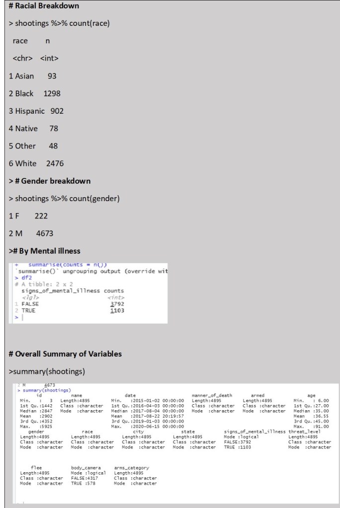
The main focus of my exploratory analysis was the shootings dataset. Before plotting any graphs I completed some initial simple summaries of the dataset by different variables of interest including Date, Race, Gender, Mental Health Status and Body camera status. The Summary() function confirmed the data ranged from 1 January 2015 to 15 June 2019. Additionally it was clear that significantly more men than women are killed by the police (222 Females to 4673 males). Interestingly the Racial breakdown in counts does show that more White people are killed by police than from any other racial category. However this is not in comparison to the racial breakdown based on proportion of the total population so is misleading without further contextual analysis. I may need to find another dataset that will provided a breakdown of racial demographics by state in percentages to better visualize the impact of the data. The initial summary also reveals that a significant proportion of people killed have exhibited signs of mental illness (over a quarter) and the police involved were only wearing body cameras in 578 of the listed cases, which is less than 15% of the time.
Following the statistical summaries, I created some rapid visualization to look at some of the variable interactions. The below bar chart is just a simple image supporting the counts summary.
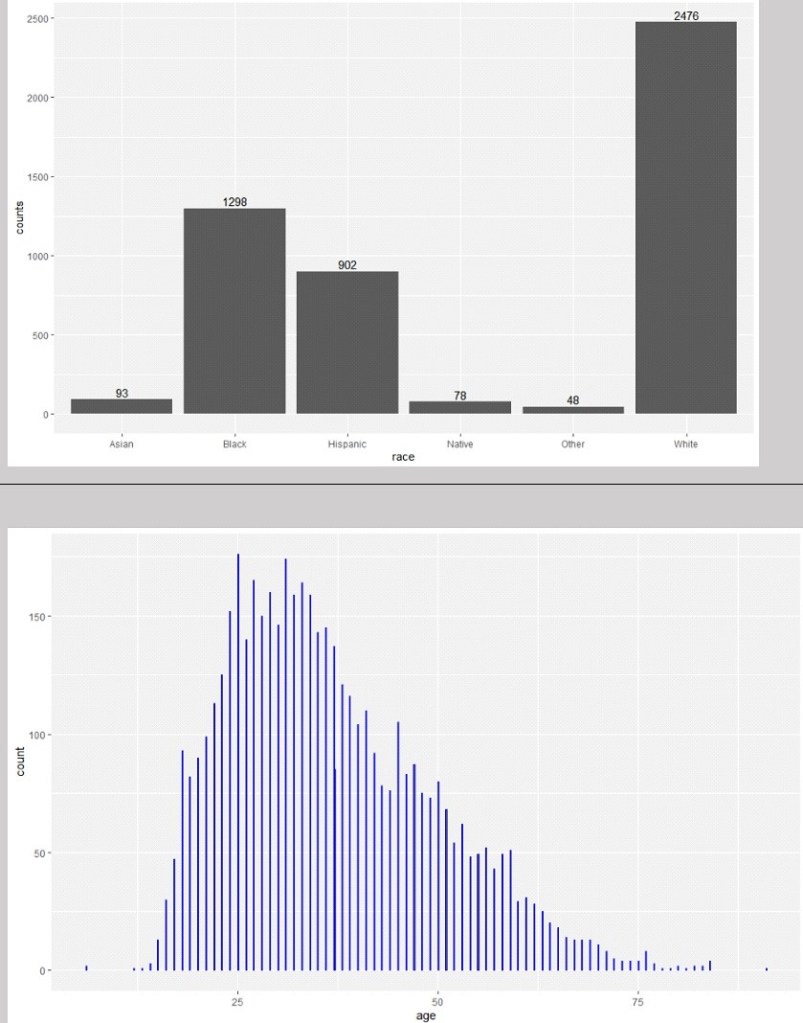
Looking at the distribution of ages alone and in comparison to racial category above, there do appear to be different distributions by race, although all are skewed towards people aged around 40 and younger. However this is particularly significant in people from Asian and Black backgrounds. There are also some outliers with ages 6 years old and 91 years old. However these are only two cases and do not appear to be influential to the distribution of the data.
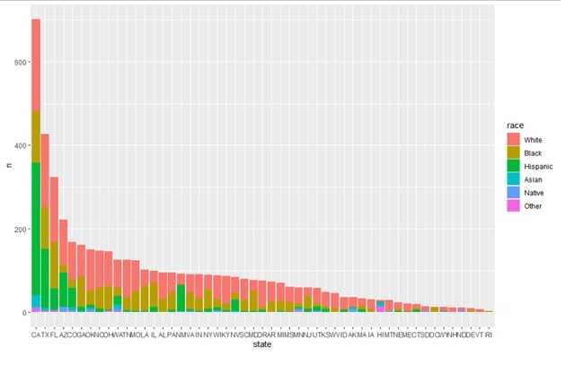
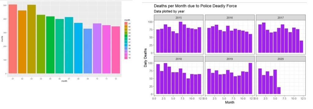
Looking at Racial breakdown and total number of police involved killings by state in order from most to least number of deaths; we can see that certain states have significantly more killings including California, Texas and Florida. It will be important to control for state population size to investigate if there is a significant correlation here. I also wanted to look at the breakdown based on dates, to see if there are any patterns by Month or Year. Below we can see that there do seem to be slightly more deaths due to police deadly force in the first 6 months of the year on average, with September being the lowest. It would be interesting to find out more about why this may be the case, although that may not fit within the scope of this project.
Initially I plotted the counts of deaths by date overtime to identify any potential trends over the years. However the data is numerous so it was hard to get anything clear from a line graph. Instead I attempted to graph the same information by monthly totally instead of daily totals and then faceted this by year to make it easier to read
3.3 Initial Results
From the initial visualization results it is clear that race and gender are potentially significant variables. Additionally I discovered that there may be some missing required variables to ensure that the final data is represented in context so as to avoid misleading or untrue conclusions. Depending on the final visualization, this may require further demographic data. Finally, some deeper analysis of the variables such as ‘armed’, and ‘fleeing’, and “signs of mental illness” will need to be completed before I can finalize my decision about the main focus of the visualization app.
4. Editorial Thinking and Justification of Charts
After consideration of the data and what information I wanted to convey, I decided to focus on the following angles:
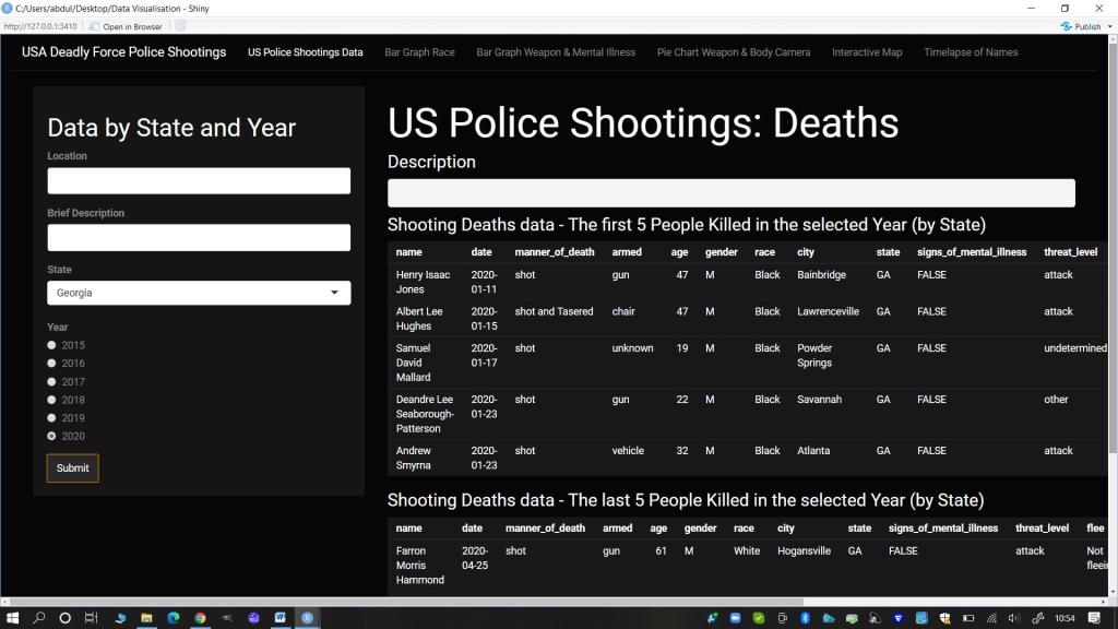
- Facts (Information Panel): I wanted the audience to be able to read the full range of information in the dataset. I decided the best way to divide the information to make it more digestible was by framing it based on State and Year levels.
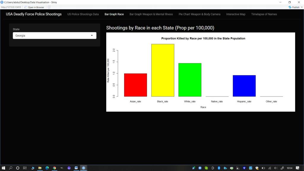
- Race (Interactive Bar plot): I wanted there to be a focus on the racial breakdown as this is a known disparity. For consistency I kept the framing choice for the bar plot visualization of this data based on State level. I also used data on state population by race to calculate the proportion of people shot per 100,000 in each state for this visualization.
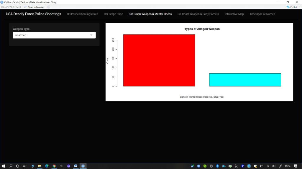
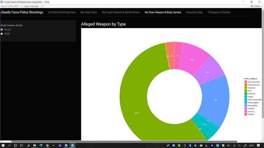
- Threat Level (Weapon), Mental Illness and Body Cameras (Interactive Bar Plot and Doughnut Chart): I felt it was important to show the range of weapons (or lack thereof) that the person killed was alleged to have possessed. I chose to juxtapose this against two variables so I made a bar plot showing the specific weapon/item split by whether there were visible signs of Mental Illness. I wanted the audience to consider where de-escalation techniques could have been the employed. I then also made a doughnut chart using the more general arms category and juxtaposed this against the variable of whether a body camera was worn and active or not. This was to get the audience thinking about the difficulty in confirming the veracity of claims that a person was an immediate and direct threat to the Police at the time of the shooting if most of the instances there was no body camera footage.
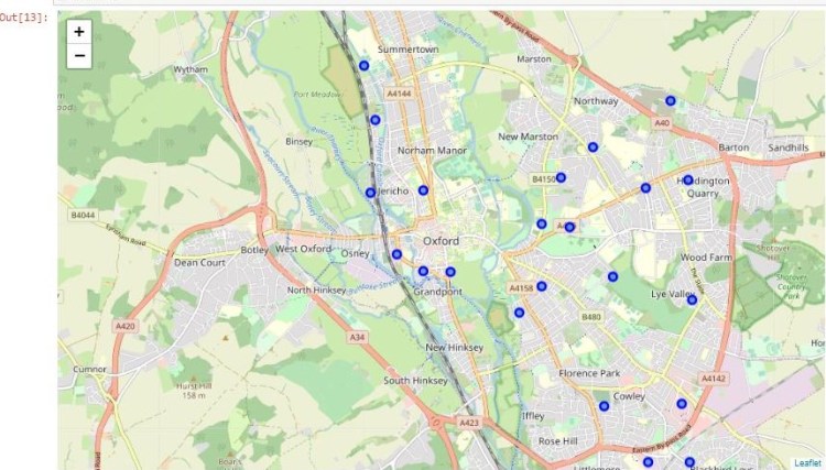
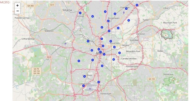
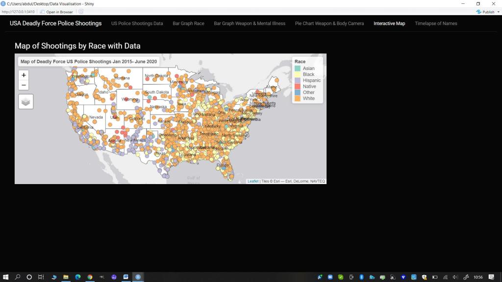
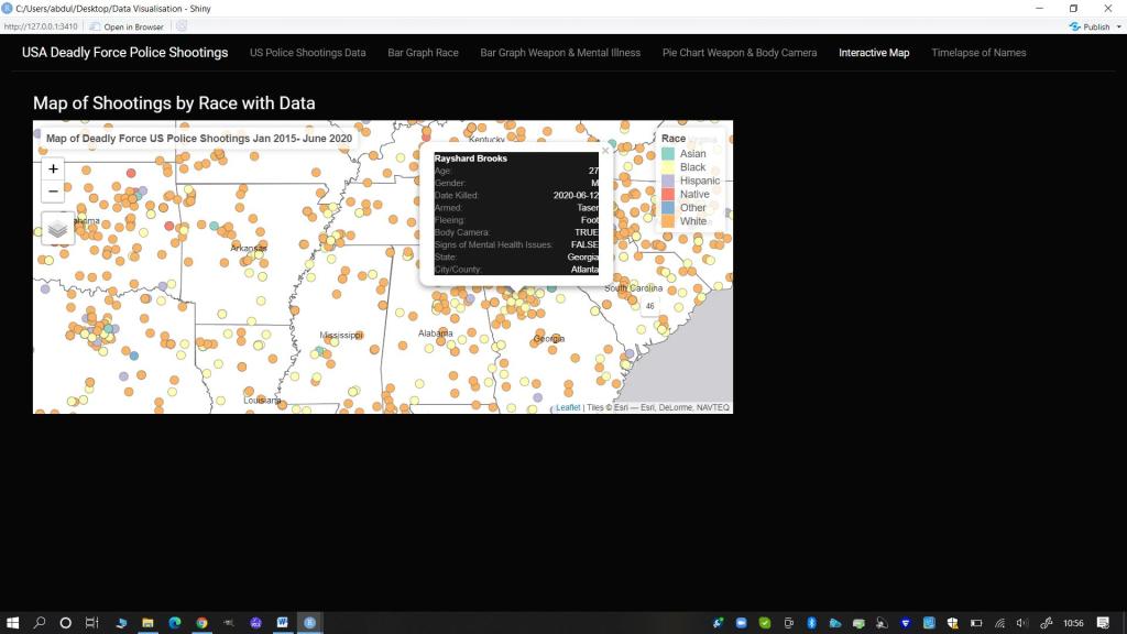
- Pop-up Information (Interactive Map): I wanted to create a map where people could click on each person killed and find out their name and more information about them. I felt a map would be useful and engaging to allow for geographical visualization of the impact of deadly force policing over just a five year period.
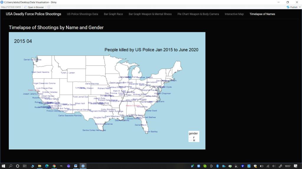
- Names (Time-lapse gif): Regardless of the alleged crimes or threat levels of those killed, I wanted to remind the audience that each of these incidents was the death of a person. To reinforce this humanity I decided to create a time lapse of the names of those killed by the police by month and year on a map of the mainland USA as the focus of the majority of the data.
4.1 Final Visualization Design and Prototype
Due to time constraints and my own knowledge and skill limits, I chose to use a similar design to the Shiny app developed during the course. However I did create unique elements such as the Race Bar plot by Proportion of the Population, an interactive map with data bubbles, and a time lapse gif, using alternative packages in R such as tmap and tmap tools. Additionally I adjusted the theme and some colours and used and manipulated my own chosen and cleaned datasets and map shapefiles, focusing on my chosen variables of interest. I chose to use a darker theme for the app panel with white text and used bolder primary and secondary colours from the Rainbow palette in R for all my visualizations.
5. Design Solution
To view the published Shiny App online, follow this link: https://theresakfoster.shinyapps.io/test/ . See below for still images of the design charts created in the Shiny App. For the data transformation and cleaning codes please see Appendices 1 and 2. To view the final Shiny App R code, please see Appendix 3 or review the separately submitted R markdown document. Finally for a demonstration of the Shiny App in action you can see the video, uploaded separately.
5.1 Stills of Visualizations from the Shiny App
Main Panel: Information Search and Display
Bar Graph: US Police Shootings -Proportion of the Population Killed (per 100,000) by Race
Bar Graph of Weapon Type Split by Signs of Mental Illness
Doughnut Chart of Arms Category split by with there was a Body Camera active
Interactive Map with points for all deadly shootings
With popups of information on the person and incident
Gif Time lapse of People Killed by Name (colour by Gender)
6. Works Cited (Data and Coding)
Anderson, E.C., Ruegg ,K.C. , Cheng, T. et al (2017) Case Studies in Reproducible Research: a Spring Seminar at UCSC. ‘Making Simple Maps with R’. Available at: https://eriqande.github.io/rep-res-eeb-2017/map-making-in-R.html
ArcGis Hub (2021) USA States (Generalized) dataset. Available at: https://hub.arcgis.com/datasets/esri::usa-states-generalized?geometry=103.901%2C29.346%2C10.912%2C67.392
Hahn, Nico (2020) Making Maps with R. online: bookdown Available at: https://bookdown.org/nicohahn/making_maps_with_r5/docs/tmap.html
Lovelace, R. ,Nowosad ,J. and Muenchow, J. (2019). Geocomputation with R. Online: CRC Press Available at: https://bookdown.org/robinlovelace/geocompr/adv-map.html
Kirk,A. (2019) Visualizing Data: A handbook for Data Driven Design (second edition). Online: Sage Available at: http://book.visualisingdata.com/chapter/0
Mran (2016) ‘tmap in a nutshell’. Online: Mran Available at: https://mran.revolutionanalytics.com/snapshot/2016-03-22/web/packages/tmap/vignettes/tmap-nutshell.html
Nazir, A. (2020) US Police Shootings dataset. Online: Kagglers Available at: https://www.kaggle.com/ahsen1330/us-police-shootings
Rdrr.io (2020) ‘renderMap: Wrapper Functions for using tmap in Shiny’. Available at: https://rdrr.io/cran/tmap/man/renderTmap.html
Rstudio Inc. (2017) ‘Render Images in a shiny app’. Online: Rstudio Available at: https://shiny.rstudio.com/articles/images.html
Sievert, C. (2019) Interactive Web Based Data Visualization with R, plotly and shiny. Online: CRC Press Available at: https://plotly-r.com/maps.html
Tennekes, M., (2018) ‘tmap: Thematic Maps in R’. Journal of Statistical Software, 84(6), 1-39 Available at: https://github.com/mtennekes/tmap#2-us-choropleth
Appendix 1: Final Eshiny App Code: R
title: “Data Visualization Assignment: Deadly US Police Shootings 2015-2020”
author: “Theresa Foster”
date: “23/04/2021”
- Install and Load Required Libraries
library(devtools)
#install.packages("rgeos")
#install_github("mtennekes/tmaptools")
#install_github("mtennekes/tmap")
#install.packages("plotly")
library(rgeos)
library(remotes)
library(shiny)
library(shinythemes)
library(data.table)
library(dplyr)
library(ggplot2)
library(DT)
library(rgdal)
library(plotly)
library(tmap)
library(tmaptools)
library(raster)
library(grid)
library(maptools)
library(sf)
library(gifski)
library(readxl)
- Upload Required Cleaned Data Files
shootings1 <- read.csv("data/shootings-all-NEW.csv", header=TRUE)
shootings_all1 <- read.csv("data/shootings-all1.csv", header=TRUE)
shootings_state <- read.csv("data/state.csv", header=TRUE)
shootings_weapon <- read.csv("data/weapon-type.csv", header=TRUE)
df.long <- read.csv("data/dflong.csv", header=TRUE)
shape <- shapefile("data/USA State shapefile/USA_States_Generalized.shp")
- Final Formatting
shootings_year <- unique(shootings_all1$Year)
shootings_camera <- unique(shootings_all1$body_camera)
- Create Maps Required
# split US in three: contiguous, Alaska and Hawaii
us_cont <- shape[!shape$STATE_NAME %in% c("Alaska", "Hawaii", "Puerto Rico"), ]
us_AL <- shape[shape$STATE_NAME=="Alaska", ]
us_HI <- shape[shape$STATE_NAME=="Hawaii", ]

#Set boundaries
US_bound <- tm_shape(us_cont, projection=2163)
AL_bound <- tm_shape(us_AL, projection = 3338)
HI_bound <- tm_shape(us_HI, projection = 3759)


# plot contiguous states
map_US <- US_bound +
  tm_polygons(col="white") + tm_text("STATE_NAME")+
  tm_layout(frame=FALSE,
            legend.position = c("right", "bottom"), bg.color="lightblue",
            inner.margins = c(.25,.02,.02,.02))

# create inset map of Alaska
map_AL <- tm_shape(us_AL, projection = 3338) + tm_text("STATE_NAME")+
  tm_polygons(col="white",legend.show=FALSE) +
  tm_layout(title = "Alaska",frame=FALSE, bg.color="lightgreen")

# create inset map of Hawaii
map_HI <- tm_shape(us_HI, projection = 3759)+ tm_text("STATE_NAME")+
  tm_polygons(col="white",legend.show=FALSE) +
  tm_layout(title = "Hawaii", frame = FALSE,
            title.position = c("LEFT", "BOTTOM"), bg.color="lightgreen")

shootings_sf <- st_as_sf(shootings1, coords = c('lng', 'lat'), crs=4326)
- Create R Shiny Coding for UI and Server
#Shiny ap code
myui <- fluidPage(theme = shinytheme("cyborg"),
                  navbarPage(
                    "USA Deadly Force Police Shootings",
                    tabPanel(
                      "US Police Shootings Data",
                      sidebarPanel(
                        tags$h3("Data by State and Year"),
                        textInput(inputId = "txtLocation",
                                  label = "Location",
                                  value = ""),
                        textInput(inputId = "txtBrief",
                                  label = "Brief Description",
                                  value = ""),
                        selectInput(inputId = "siType",
                                    label = "State",
                                    choices = shootings_state),
                        radioButtons(inputId = "rbMonth",
                                     label = "Year",
                                     choices = shootings_year),
                        actionButton(inputId = "btnSubmit",
                                     label = "Submit")
                      ),
                      mainPanel(
                        tags$h1("US Police Shootings: Deaths"),
                        tags$h4("Description"),
                        verbatimTextOutput("txtOutput"),
                        tags$h4("Shooting Deaths data - The first 5 People Killed in the selected Year (by State)"),
                        tableOutput("tabledataHead"),
                        tags$h4("Shooting Deaths data - The last 5 People Killed in the selected Year (by State)"),
                        tableOutput("tabledataTail"),
                      )
                    ),
                    tabPanel(
                      "Bar Graph Race",
                      sidebarPanel(
                        selectInput(inputId = "siRaceTP3",
                                    label = "State",
                                    choices = shootings_state),
                      ),
                      mainPanel(
                        tags$h4("Shootings by Race in each State (Prop per 100,000)"),
                        plotOutput(outputId = "bar1")
                      )
                    ),
                    tabPanel(
                      "Bar Graph Weapon & Mental Illness",
                      sidebarPanel(
                        selectInput(inputId = "siTypeTP2",
                                    label = "Weapon Type",
                                    choices = shootings_weapon),
                      ),
                      mainPanel(
                        plotOutput(outputId = "bar")
                      )
                    ),
                    tabPanel(
                      "Pie Chart Weapon & Body Camera",
                      sidebarPanel(
                        radioButtons(inputId = "rbcameragg",
                                     label = "Body Camera Active",
                                     choices = shootings_camera),
                      ),
                      mainPanel(
                        tags$h4("Alleged Weapon by Type"),
                        plotOutput(outputId = "piechartgg", width = "100%", inline=TRUE)
                      )
                    ),
                    tabPanel(
                      "Interactive Map",
                      mainPanel(
                        tags$h4("Map of Shootings by Race with Data"),
                        tmapOutput(outputId = "map")
                      )
                    ),
                    tabPanel(
                      "Timelapse of Names",
                      mainPanel(
                        tags$h4("Timelapse of Shootings by Name and Gender"),
                        imageOutput(outputId = "gif"),
                      )
                    )
                  )
)

myserver <- function(input, output, session){

  # Week 3
  datasetInputHead <- reactive({
    shootingsData <- shootings_all1[which(shootings_all1$state_name == input$siType),]
    shootingsData <- shootingsData[which(shootingsData$Year == input$rbMonth),]

    print(head(shootingsData,5))
  })

  datasetInputTail <- reactive({
    shootingsData <- shootings_all1[which(shootings_all1$state_name == input$siType),]
    shootingsData <- shootingsData[which(shootingsData$Year == input$rbMonth),]

    print(tail(shootingsData,5))
  })

  output$txtOutput <- renderText({
    paste(input$txtLocation, input$txtBrief, sep = "\n\n")
  })

  output$tabledataHead <- renderTable({
    if (input$btnSubmit>0){
      isolate(datasetInputHead())
    }
  })

  output$tabledataTail <- renderTable({
    if (input$btnSubmit>0){
      isolate(datasetInputTail())
    }
  })

  #Bar 1
  output$bar1 <- renderPlot({

    Racedata <- df.long[which(df.long$Location==input$siRaceTP3),]

    barplot(Racedata$value,
            main = "Proportion Killed by Race per 100,000 in the State Population",
            ylab = "Rate Killed per 100,000",
            xlab = "Race",
            names.arg = Racedata$variable,
            col = rainbow(length(Racedata$variable)))
  })

  output$piechartgg <- renderPlot({
    weaponByType <- shootings_all1[which(shootings_all1$body_camera == input$rbcameragg),]
    weaponByType <- weaponByType[,c("body_camera", "arms_category")]
    weaponByType <- count(weaponByType, arms_category)

    weaponByType <- arrange(weaponByType,desc(arms_category))
    weaponByType <- mutate(weaponByType, ypos = cumsum(n) - 0.5*n)

    ggplot(weaponByType, aes(x = 2, y = n, fill = arms_category), col=rainbow(24)) +
      geom_bar(width = 1, stat = "identity", color = "white") +
      coord_polar("y", start = 0)+
      geom_text(aes(y = ypos, label = n), color = "white")+
      theme_void()+
      xlim(0.5, 2.5)
  }, height = 800, width = 1200)

  # bar 2
  output$bar <- renderPlot({
    shootingData <- shootings_all1[which(shootings_all1$armed == input$siTypeTP2),]

    totalweapon <- count(shootingData, signs_of_mental_illness)

    barplot(totalweapon$n,
            main = "Types of Alleged Weapon",
            ylab = "Count",
            xlab = "Signs of Mental Illness (Red: No, Blue: Yes)",
            names.arg = totalweapon$signs_of_mental_illness,
            col = rainbow(length(totalweapon$signs_of_mental_illness))
    )
  })

  # Map
  output$map <-renderTmap({ map_US + map_AL+ map_HI +  tm_shape(shootings_sf)+tm_dots(size= 0.1, col="race", title= "Race", id="name", popup.vars = c("Age:" = "age", "Gender:" = "gender","Date Killed:"="date", "Armed:"="armed","Fleeing:"="flee", "Body Camera:"="body_camera", "Signs of Mental Health Issues:" = "signs_of_mental_illness","State:" = "state_name", "City/County:"= "city"))+
      tm_layout(title= "Map of Deadly Force US Police Shootings Jan 2015- June 2020",title.position = c('right', 'top'))+tmap_mode("view")
  })

  #gif

  output$gif <- renderImage({
    # When input$n is 1, filename is ./images/image1.jpeg
    filename <- normalizePath(file.path('data/urb_anim4.gif'))

    # Return a list containing the filename
    list(src = filename)
  }, deleteFile = FALSE)

}
- Run the Shiny Ap
“`{r}
shinyApp(ui=myui, server=myserver)
if (interactive()) app